Serenity in Layers: Neutral Palettes with Touchable Depth

We explore neutral color schemes and textural depth for a refined living space, revealing how quiet palettes and tactile layers create serenity without sterility. Expect practical color strategies, lighting insights, and material pairings, plus relatable stories and small steps you can try today. Share your questions, tell us which corner of your home needs calm first, and subscribe to follow each transformation.

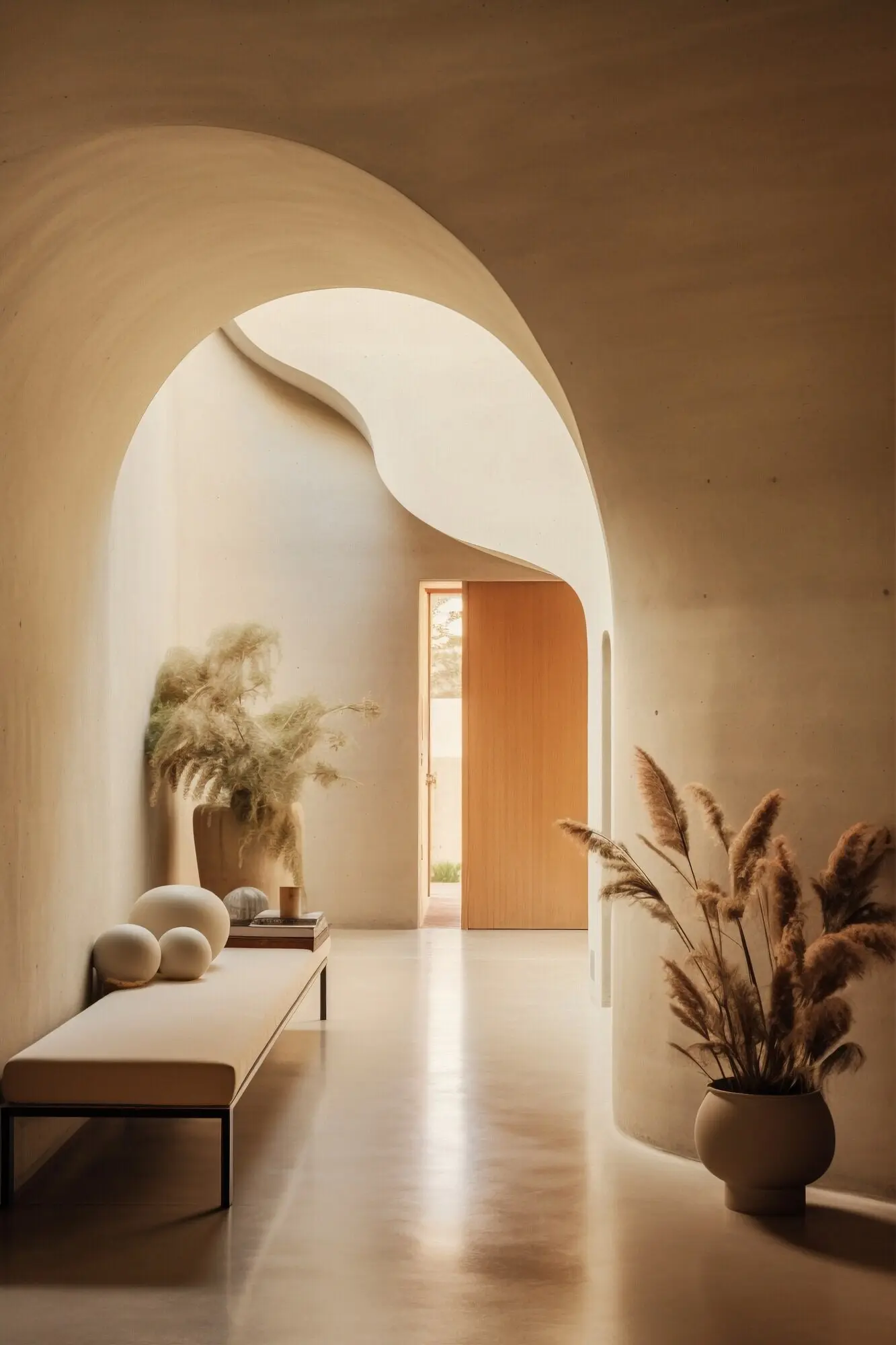
Foundations for Calm, Cohesive Color

A refined living space begins with a palette that whispers, not shouts. Choose neutrals by reading undertones, considering light reflectance, and balancing warm and cool influences. By mapping how daylight travels through your rooms, you can guide paint, textiles, and surfaces to feel consistent, effortless, and deeply comforting, while still allowing nuanced variation and purposeful depth.

Reading Undertones with Confidence

Place large swatches beside pure white and natural wood to reveal sneaky green, red, or violet undertones in otherwise similar neutrals. Compare in morning and evening light, then test sheen levels on a primed card. Prioritize a greige or taupe that remains stable across rooms, letting you build layers without sudden temperature shifts or unexpected color casts.

Creating a Room-to-Room Flow

Repeat one anchor neutral through baseboards, doors, or ceilings to stitch spaces together. Then adjust depth by a step or two on the same color strip for adjoining rooms. Echo fabrics, stone, and metal finishes to maintain continuity, allowing gentle contrast only where texture can carry the interest. Your eye relaxes, and the home feels thoughtfully connected.

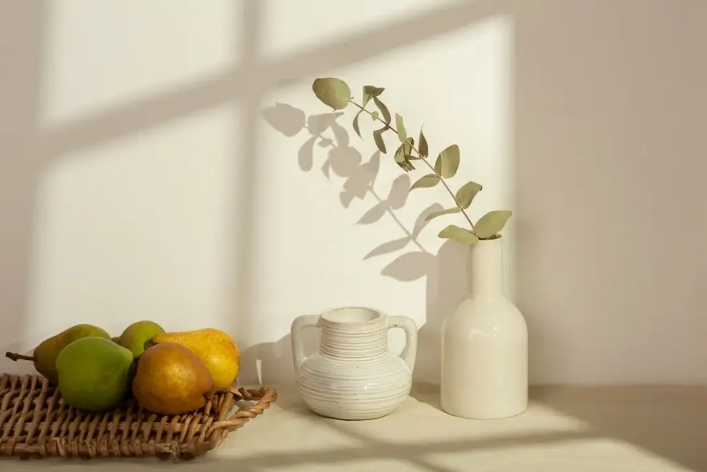
Warmth, Coolness, and Seasonal Balance

North-facing rooms often benefit from warmer beige or creamy clay, while sun-drenched spaces shine with balanced greige to avoid glare. Consider seasonal shifts: winter’s low light can cool walls, summer’s intensity can wash them out. Choose slightly warmer neutrals than your first instinct, letting natural textures add coolness, rather than relying on blue-gray paints that risk feeling austere.

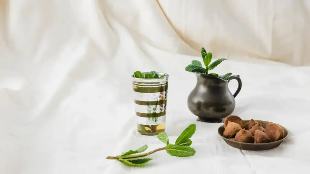
Textiles that Invite Touch

Layer a grounded wool rug with a linen slipcovered sofa, then add a bouclé accent chair and a cashmere throw for temperature and tactile variation. Mix tight weaves and open slubs to catch shadow gently. Keep patterns subtle, like herringbone or basketweave, so texture leads. Guests will notice how comfortable everything feels before they notice how quiet the colors are.

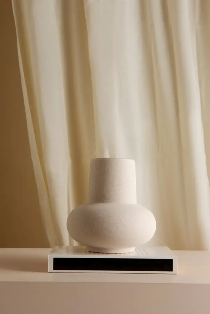
Character in Hard Surfaces

Honed marble, wire-brushed oak, tumbled limestone, and raked plaster add history without visual noise. Pair matte finishes with just a hint of reflection on metal edges or hardware, letting the eye rest on grain and tool marks. Small irregularities tell a human story. If budgets are tight, consider porcelain with convincing movement, saving natural stone for a compact, high-impact area.

Mapping Daylight and Orientation

Observe your rooms hourly for one full day, noting how color shifts across walls, floors, and furnishings. South and west light warms, north light cools, east light sparkles early then softens. Use sheer linens to diffuse harsh rays, and position mirrors sparingly, bouncing light onto textured surfaces rather than washing out your focal wall. Control, not chance, guides harmony.

After-Dusk Warmth Without Yellowing

Choose layered lighting: a warm-white ambient base, focused task lamps, and soft accent sources like picture lights. Keep the color temperature consistent within 2700–3000K to avoid jarring shifts. Finishes with gentle reflectance—satin paints, honed stone—carry glow without hotspots. When light quality stays coherent, neutrals feel intimate and elegant, not yellow or flat. Dimmer switches become your nightly mood dial.

Furnishing with Quiet Confidence

Furniture in neutral spaces should feel timeless, comfortable, and well-proportioned. Think softly tailored silhouettes, generous seat depths, and materials that age gracefully. Avoid harsh contrasts; instead, build interest by mixing textures and subtle tones within a single family. Honest construction—visible joinery, real wood, touchable upholstery—creates a refined backdrop that invites living, lingering, and layering over time without visual fatigue.

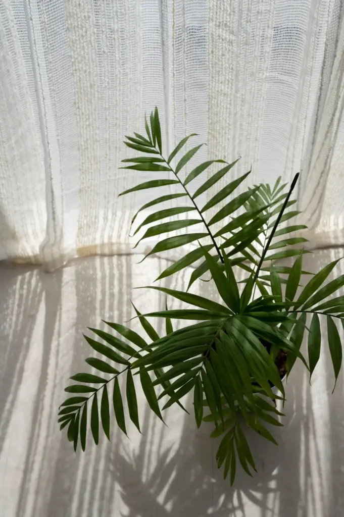
Art, Botanicals, and Meaning

Personal pieces keep neutral rooms from feeling anonymous. Curate art with negative space, gentle contrast, and palpable texture—think charcoal drawings, botanical studies, or monochrome textiles. Add plants for life and movement, letting foliage act like another neutral. Display collected objects sparingly, highlighting stories rather than filling surfaces. The result is quietly expressive, grounded in memory and natural rhythm.

Living with Ease and Longevity

Refined does not mean precious. Choose materials that welcome daily life, patinate beautifully, and clean easily. Performance fabrics, durable rugs, and forgiving finishes safeguard the calm you create. Establish simple routines—soft-brush dusting, gentle cleansers, seasonal fabric care—so maintenance feels natural. Your space remains livable and elegant, an environment designed for real stories, not just photographs or fleeting perfection.

Performance Fabrics Made Beautiful

Look for solution-dyed fibers, stain-resistant treatments, and tight weaves that mimic natural hand. Test with coffee, wine, and marker on fabric samples before ordering. Mix performance with genuine linen or wool on lower-touch surfaces to keep authenticity. One family reported relaxed hosting after upgrading slipcovers—spills became minor inconveniences, not disasters—proving durability can quietly support generosity and connection every day.

Family- and Pet-Proof Choices

Select rugs with subtle patterning and medium tone to disguise everyday life, plus removable cushion covers for quick washes. Rounded edges reduce dings, and textured paint hides little fingerprints. Keep a lidded basket for speedy tidying. Designate a pet throw that complements your palette, embracing fur as part of the narrative. Real homes, not showrooms, deserve thoughtfulness and grace.

Budget-Smart Layers and DIY Tactility

You can achieve richness without overspending by focusing on high-impact surfaces and handmade finishes. Prioritize paint, lighting, and one tactile statement per room. Introduce affordable depth through limewash, plaster effects, and layered textiles. Phase purchases thoughtfully, celebrating progress rather than perfection. Invite conversation, ask for feedback, and share your own experiments—our community learns fastest when we build quietly, together.

Priorities that Change Everything

Allocate most of the budget to color accuracy, a quality rug underfoot, and flexible lighting. Then select a single standout texture—plaster fireplace, handwoven headboard, or ribbed sideboard—so the room gains identity without clutter. Secondary items can be simplified, thrifted, or refreshed with hardware. This hierarchy protects calm, guiding choices toward enduring value and away from scattered impulse buys.

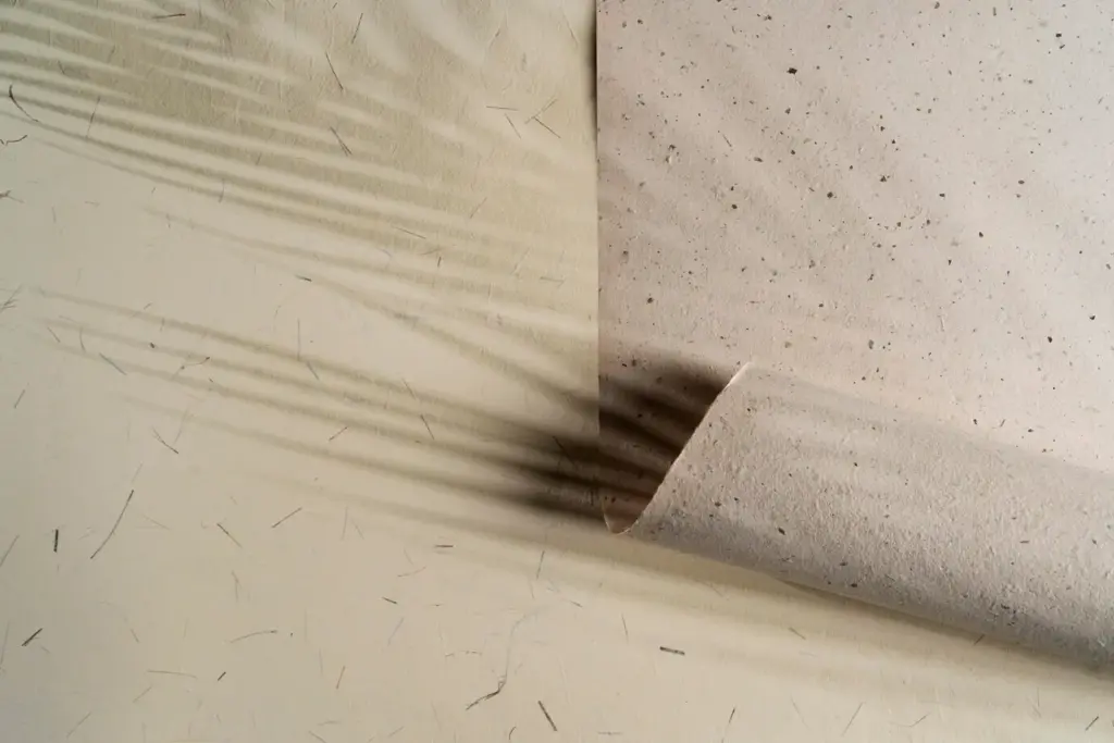
Handmade Finishes with Big Impact

Try breathable limewash for cloudlike walls, or apply a thin venetian plaster on a focal plane to catch light softly. Experiment on sample boards first, adjusting dilution and stroke direction. Even a simple Roman clay finish transforms corners. Document your process, share successes and fails, and encourage neighbors to try. Imperfect handwork adds soul that manufactured sameness simply cannot match.

Layer Slowly, Share Progress

Resist finishing everything in one weekend. Live with each addition—a rug, a lamp, a throw—then notice what the room asks for next. Post a photo, request community suggestions, and iterate. This gentle pace prevents costly missteps, ensures textures feel intentional, and deepens your ownership of the space. Refinement grows naturally when patience frames every decision, not urgency or trends.

Zunatitunonale
Privacy Overview

This website uses cookies so that we can provide you with the best user experience possible. Cookie information is stored in your browser and performs functions such as recognising you when you return to our website and helping our team to understand which sections of the website you find most interesting and useful.